All posts by kleucht

Sun ‘n Fun Airshow at Lakeland, FL

I took a much deserved day off work on Friday and attended the Sun ‘n Fun Fly-In and Air Show in Lakeland, Florida with my buddy Les. It was a beautiful day for an airshow and this was quite an airshow.

.SUN n FUN

First we walked around and looked at all the homebuilt airplanes that were there for the fly-in. Then we walked around all the vendor exhibits for a while. Then we watched the airshow and it was quite impressive. Then after a dinner break, they put on a very cool night airshow. And after that, they put on the most spectacular fireworks display I think I’ve even seen in my entire life! It was quite a day. Here is a short video compilation that I posted to YouTube: http://www.youtube.com/watch?v=8UqFCnRzDso

And here are some of the photos I took:

.Sun 'n Fun

.Sun 'n Fun

.Sun 'n Fun

.Sun 'n Fun

Kurt

KSC Beach Cleanup

Last week I was able to take part in an annual beach cleanup on the very remote beaches of the Kennedy Space Center. It was a lot of hard work, but it was pretty cool to take part in this worthy cause. I put a short video from the beach cleanup on YouTube:
http://www.youtube.com/watch?v=jjT6dTbacg0

This is an annual event at KSC and it is organized by the Fish & Wildlife Service, who owns most of the land that KSC sits on. They do this every year before sea turtle nesting season starts.

There were some pretty interesting items that were collected, in addition to a ton of bottles and bottle caps, which I noticed were the most frequent item found. A lady right directly in front of me found 2 separate messages in bottles. One of them was a letter from a 9 year old girl in the Bahamas who’s whole class had put messages into bottles for a “sea-pal” exercise. The lady who found the message said she was definitely going to write the little girl back. I found quite a few bottles, but none with messages.

It was hard work in the hot sun, but I’m going to sign up again next year.

Kurt

User Interface Annoyances: Indicator Buttons

As a software programmer, I feel the need to make the user happy so that they will like my product. We all just want to be loved, right? In order to make the user of my software happy, the user interface must not be annoying and the whole user experience must be positive. I personally have lots of opinions about what should and should not be done in a user interface, and I’m sure the whole world will not be totally in agreement with all of my opinions, and that’s fine. We can agree to disagree.

Today’s annoying user interface is inside the elevator in my building at work. It’s not very nice to make your floor indicators (which cannot be pressed by the user) look exactly like the floor selection buttons. (Sorry about the poor quality photos.)

.
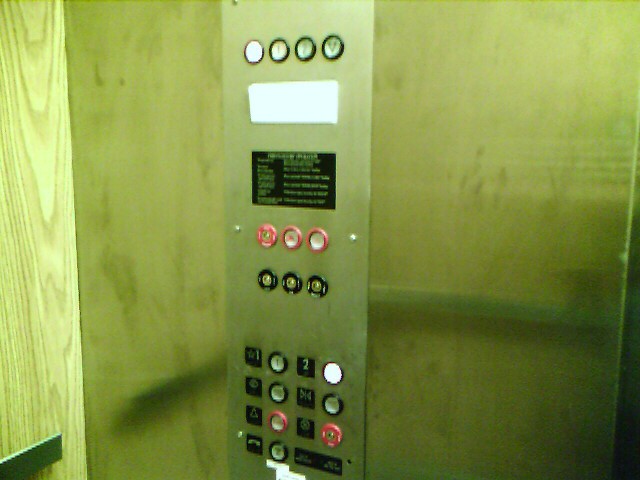
Now, I consider myself a fairly sharp guy, but on the rare occasion that I actually use the elevator in my 2-story building, the indicator lights which look exactly like the floor buttons always throw me for a loop. They look like buttons that can be pressed.
.
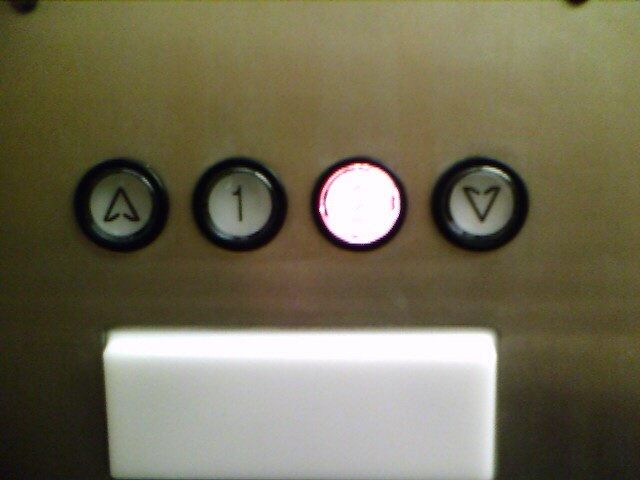
The only reason I haven’t been tricked into pressing them is because they are way up high on the panel. But still, last time I was in the elevator I had to try to press them just to make sure they were not actually buttons. They’re not. But they sure look like buttons. Why would any user interface designer in their right mind design an indicator to look exactly like a button? Is this a game they play just to mess with our minds or something?

This would be even more annoying if this were done on a software user interface. But I don’t have any examples of that to post right now. Let’s just try to avoid using buttons as indicators, shall we?

Just my opinion,

Kurt (with a tip of my hat to Joel Spolsky)

User Interface Annoyances: Blind Confirmations

As a software programmer, I feel the need to make the user happy so that they will like my product. We all just want to be loved, right? In order to make the user of my software happy, the user interface must not be annoying and the whole user experience must be positive. I personally have lots of opinions about what should and should not be done in a user interface, and I’m sure the whole world will not be totally in agreement with all of my opinions, and that’s fine. We can agree to disagree.

But one thing that I think is a bad idea is to pop up a dialog to the user that asks them if they are sure, without giving them any more information.

.

On an Internet Forum that I’m a member of we use the very popular forum software phpBB. And this evening I kept seeing this same “blind” confirmation dialog over and over again as I was making various unrelated configuration changes to my account profile. If something is worthy of an “are you sure you want to do this” type of dialog, then surely telling the user what they are about to do and why it could be bad is also worthy of mentioning? When I try to close Word without saving my document, it doesn’t just say “Are you sure?”. It says something more along the lines of “Don’t you want to save your document before closing Word?”.

Just my opinion,

Kurt (with a tip of my hat to Joel Spolsky)