This past Friday I had the honor of giving the morning keynote presentation at the 6th annual DevDay software developer conference in Krakow, Poland! Here is the website! (Check it out! It actually has my face on it!)
![]()
This conference is sponsored by ABB Automation Group, which is a huge industrial robotics company in Europe. They also manufacture industrial electronics, industrial control systems, and industrial power systems. They’re kind of a big deal.
DevDay is a 2 day conference for software developers that is limited to only 500 attendees, so it’s a small and intimate event. The speakers are truly able to interact with the attendees and networking at this event is highly encouraged by the organizers. During the 2 days, DevDay packed in 4 separate keynotes and a total of 30 technical sessions! It was a really great event! The organizers did a wonderful job!
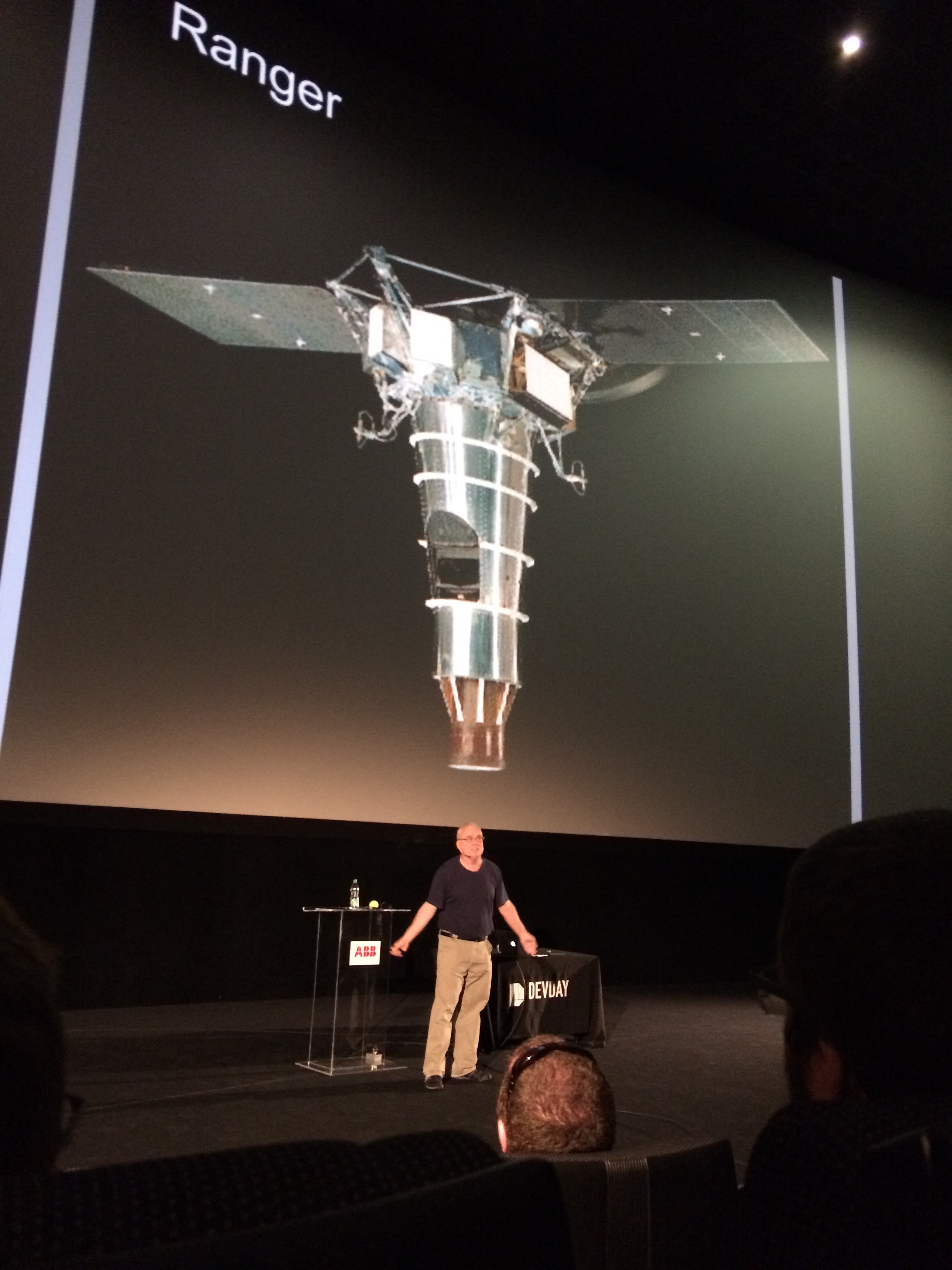
The DevDay organizers feel strongly enough about using only live speakers, that they pay for their airfare, hotel, food, and also ground transportation. The venue for the conference was a movie theater and the screens were enormous! Can you imagine giving a keynote address on a screen like this?!?!?
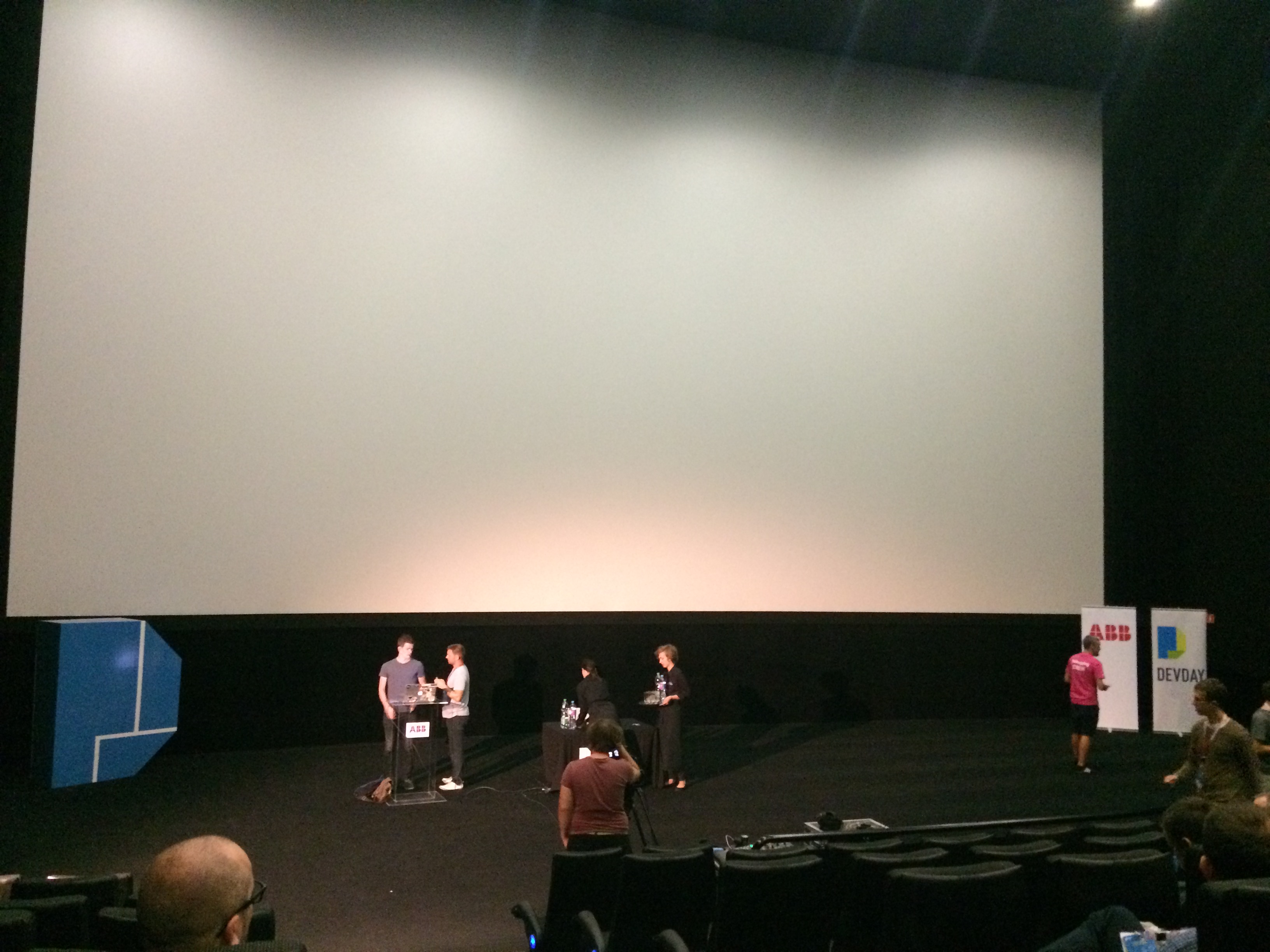
By the way, that’s Zach Holman in the photo getting ready to give his keynote.
My keynote presentation was called “We Are The Explorers!” and it presents the story of the great westward expansion by the early American pioneers. It describes how difficult the task was and how great the payoff was. It then explains how the settlers had to live off the land to survive and then it transitions to NASA’s space exploration plans and how we will have to live off the land too. Then it shows off a bunch of living-off-the-land technologies (ISRU) that are being developed by NASA to support future planned long term human exploration missions on Mars.

Here is the official DevDay 2016 video of my keynote on YouTube:
My keynote presentation was very well received and I got a ton of compliments from both attendees and from other speakers! One of the biggest compliments I received was from another speaker who speaks at a lot of conferences all over the world. He said “You rehearsed the *bleep* out of that, didn’t you?”. Yes, I did rehearse the *bleep* out of my keynote during the weeks leading up to the conference. I guess it paid off. 🙂
I also gave a technical presentation called “NASA’s ant-inspired Swarmie robots” which gives the background of the Swarmie project and describes the software technologies that we used as well as various challenges and solutions that we encountered along the way.

Here is the official DevDay 2016 video of my technical presentation on YouTube:
Full videos of all the keynotes and talks, are posted on the DevDay YouTube channel:
https://www.youtube.com/user/ABBDevDay/

There are tons of great professional photos from the event posted on their Flickr account too:
https://www.flickr.com/photos/96896358@N04/albums
![]()
Here are my favorite professional photos, though:


One of the highly experienced professional speakers at this conference paid me a huge compliment after my keynote when he asked me how long I had been a Tech Evangelist for NASA. He didn’t know that this was my very first professional conference keynote speech. Sure, as a NASA employee, I speak to students a lot. And I give technical presentations to co-workers and to managers all the time. But the keynote at a conference like this. Never before. I’m honored to have been invited to come speak at this amazing conference!
Also, this was the first time I’d ever left the United States. I had a really great experience! Tomorrow I’ll publish a blog post about the sightseeing that I was able to squeeze in during my short time in Krakow, Poland.
Thanks for your interest!
Kurt
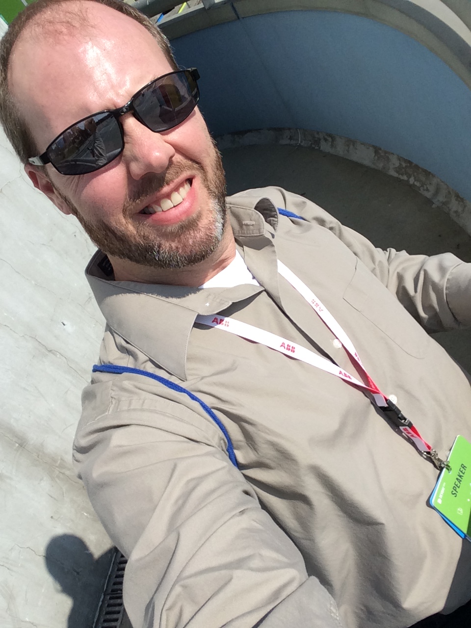
P.S. Here’s a selfie of me standing outside the venue soaking up some sun in an effort to counteract some of my jetlag.
P.S.S. And here is a photo I took of Russ Olsen giving the closing keynote which was a very inspirational story about the race to land a man on the moon!
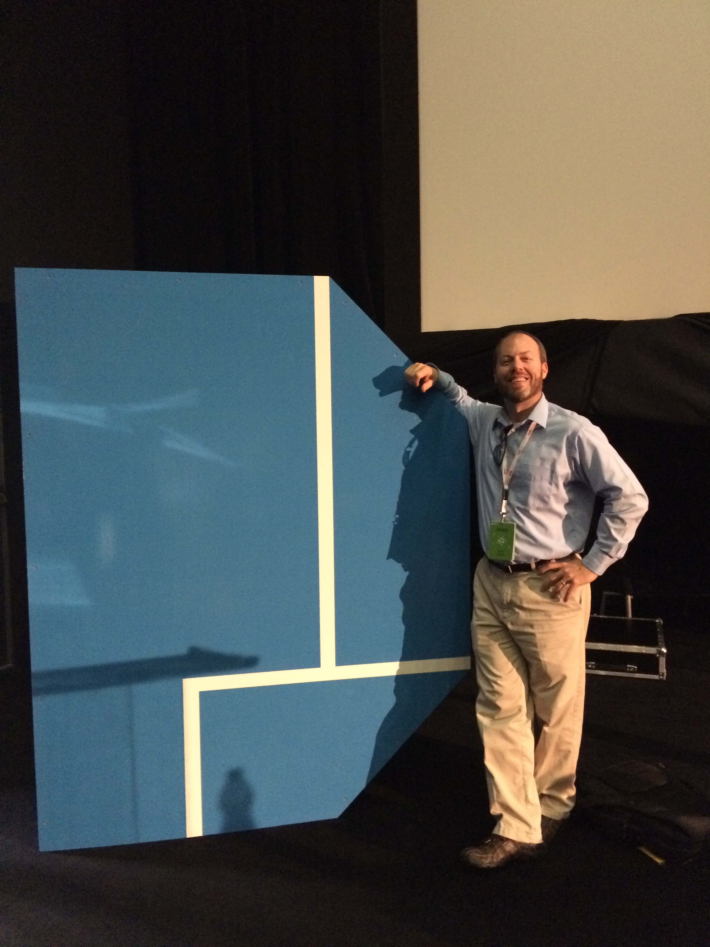
P.S.S.S. And finally, here is just a photo of me striking a pose after the conference was over.