I recently saw this sign at the Sanford airport. I knew where I was going when I saw the sign, but the sign actually confused me and made me stop and think about whether I was going the right direction. I knew the mens bathroom was on the left, but the woman/man figures were on the wrong side. I wonder how many people see this sign and actually go into the wrong bathroom because of it.
Tag Archives: confusing
What does this sign mean?
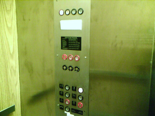
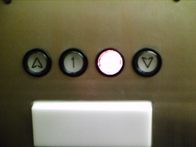
User Interface Annoyances: Indicator Buttons
As a software programmer, I feel the need to make the user happy so that they will like my product. We all just want to be loved, right? In order to make the user of my software happy, the user interface must not be annoying and the whole user experience must be positive. I personally have lots of opinions about what should and should not be done in a user interface, and I’m sure the whole world will not be totally in agreement with all of my opinions, and that’s fine. We can agree to disagree.
This would be even more annoying if this were done on a software user interface. But I don’t have any examples of that to post right now. Let’s just try to avoid using buttons as indicators, shall we?
Just my opinion,
Kurt (with a tip of my hat to Joel Spolsky)
User Interface Annoyances: Labeled Toggle Buttons
As a software programmer, I feel the need to make the user happy so that they will like my product. We all just want to be loved, right? In order to make the user of my software happy, the user interface must not be annoying and the whole user experience must be positive. I personally have lots of opinions about what should and should not be done in a user interface, and I’m sure the whole world will not be totally in agreement with all of my opinions, and that’s fine. We can agree to disagree.
But one thing that I think is a bad idea is to use a toggle button to turn on or off a certain feature and to put a text or image label that states the current value of the feature onto that toggle button. Was that sentence confusing? Well, so is a labeled toggle button! And what’s the last thing you want your user interface to do? Confuse the user!
.
I use PrintKey 2000 as my free screen capture software. Yeah, it’s old and outdated, but it works for me and I haven’t felt the need to go out searching for a replacement. Hey, if it ain’t broke …
All of the big fat buttons across the top actually do what their label says … all except for one, that is. The button labeled “OFF” does NOT actually turn something OFF. It does just the opposite of turning something OFF. It turns something ON. It’s a toggle button for the Auto Save feature and the current state of the Auto Save feature is OFF, so when you click on the button labeled OFF, it will turn the Auto Save feature ON and change the label on the button to read ON.
So the button is telling the user the current value of the feature, not what action the button will perform when pressed. But users are used to buttons doing what their label says. The Print button prints, the Save button saves, etc. But this one button acts differently than all other buttons in the world?!? Why? This sort of user interface behavior is not intuitive to most users and should be avoided.
Solution: If the value of the feature were placed into a text field that is separate but adjacent to the toggle button and the toggle button was labeled something like “Auto Save”, that would be just fine. It might be even better if the button label were “Toggle Auto Save”, but I realize that might be too wordy. Another solution would be for features that can be toggled, to forgo buttons altogether and use checkboxes with labels instead. A checkbox labeled “Auto Save” would turn the feature on when the box is checked and vise-versa. I think most users would find that intuitive.
Just my opinion,
Kurt


